Operating the slides
- Press escape for an overall view of the slides slides
- Use the arrow keys to navigate horizontally or vertically
- Or use the buttons in the bottom right corner.
Web accessibility for developers

Web accessibility for developers
Web accessibility
Websites and apps are perceivable, operable,and understandable, even if:
- You've got a disability
- You're getting older
- You're limited due to specific circumstances.

About 15% of the world's population lives with some form of disability.
Belgian population
19% is over the age of 67 in 2024.
Websites and apps
- People want to participate in the digital world regardless of disability.
- Often 'early adopters'.
- This is possible when websites and apps are accessible.
Legislation and standards
European Directive
Directive (EU) 2016/2102 of the european parliament and of the council of 26 October 2016 on the accessibility of the websites and mobile applications of public sector bodies
European Directive
- Websites (as of September 2020) and apps (as of June 2021) by government institutions must be accessible according to the Web Content Accessibility Guidelines 2.1 Level AA.
- Each website or app has an accessibility statement.
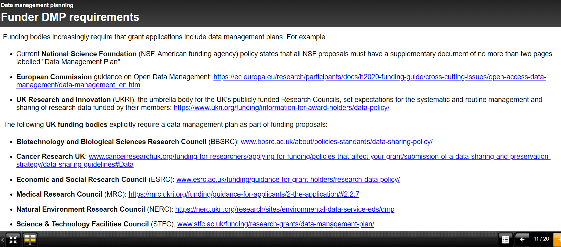
- FOD Bosa is responsible for the enforcement, monitoring, and reporting: https://accessibility.belgium.be
WCAG Standard
- 2008: Web Content Accessibility Guidelines 2.0
- 2018: Web Content Accessibility Guidelines 2.1
- 3 levels
- 50 success criteria on level AA
- Technical support guidelines
Accessibility statement
- Which accessibility requirements does the website/app meet?
- How was this tested?
- If there are parts that are inaccessible, what is the temporary alternative?
- How can a user report accessibility issues?
- Which procedure is available to the user if no (adequate) reply to their feedback is given?

Belgium in 2020


9 personas
- 9 different ways of using a computer, smartphone, or tablet
- Obstacles
- Assistive technology and solutions
Nina has ADHD

Nina has trouble focusing. She's very sensitive to sensory stimuli, and often forgets things.
Distractions
- Slideshows (-/+)
- Animated gifs
- Background video's
- Pop-ups
Pop-ups
Expected vs. Unexpected
Best practices
- Use a pause button to give control to the user
- No autoplay
- Be mindful of background images and other distractions
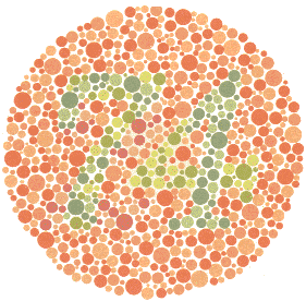
Jerry is colour blind

Jerry has difficulties telling red and green apart.
8% of all men are colour blind
- Deuteran (green - common)
- Protan (red - rare)
- Tritan (blue - very rare)
Source: We are colorblind

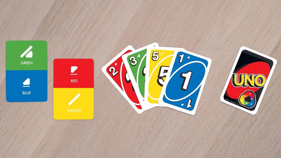
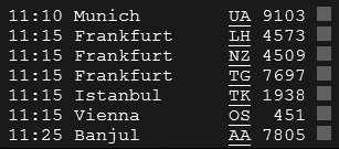
 Information about arrivals and departures
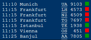
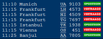
 The same information with color and text
Pie chart - inaccessible to Jerry
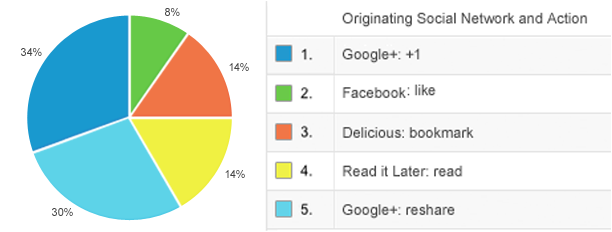


Best practice
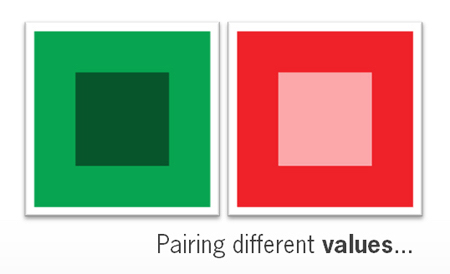
Use more than just colour to convey information.
Kadisha has cataract

Kadisha can't read all of the numbers in this table.
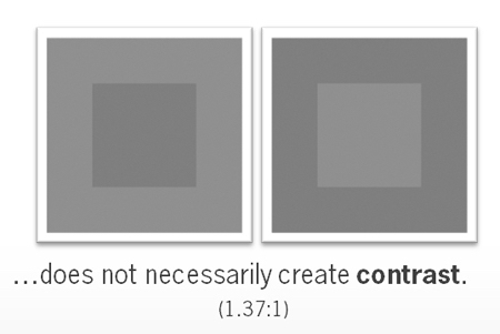
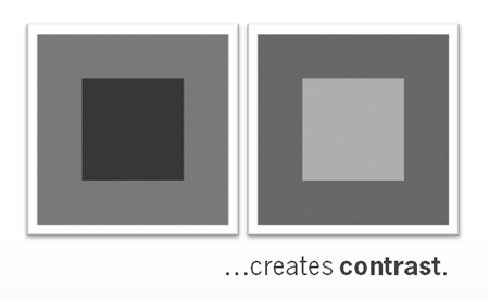
Provide sufficient contrast between the text and the background colour.
Contrast for non-text components
- User interface components
- Images necessary to understand content
- Contrast with adjacent colours
Magnification and responsive design
Build responsive websites.
Spam prevention
Most CAPTCHA's are inaccessible: provide accessible alternatives.
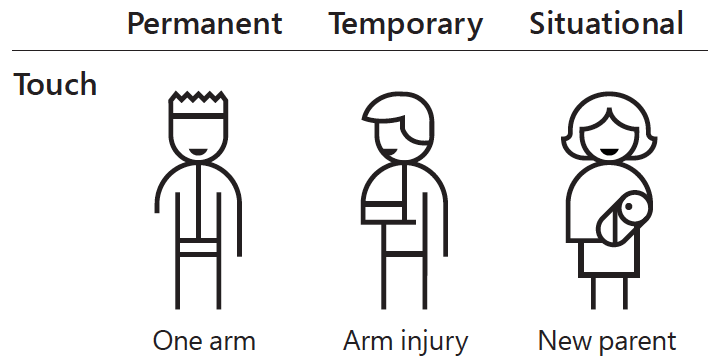
Jim has a motor impairment

Jim can't use a mouse.He uses a headstick and a keyboard, instead.
Try it yourself
- Tab: next interactive element
- Shift + tab: previous interactive element
- Enter: activate link or button
- Spacebar: select checkbox or radio button
- Up and down arrow keys: select list item
Example 1 - visible focus
Try to reach the following pages by using the tab key.
Example 2 - drop-down menu
Try to expand the main menu without using the mouse.
Best practice
- Provide visible focus
- All functionalities that can be achieved by using a mouse must work when using a keyboard as well.
Vera has ALS

Switch control


"It took me too long to fill in the form, and it disappeared. Now I'm back in the queue. I'll probably miss out on those concert tickets."
Best practice
Give users enough time to complete their actions.
Caroline has RSI

Repetitive Stress Injury causes Caroline wrist- and shoulder pain. She uses voice recognition software in order to rest her arm and avoid any further injury.
Example
Caroline can't click on an icon unless she knows its name.
Best practice
- Give icons a visible label
- Use meaningful links and alternative texts
- Use structural elements correctly
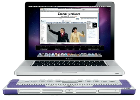
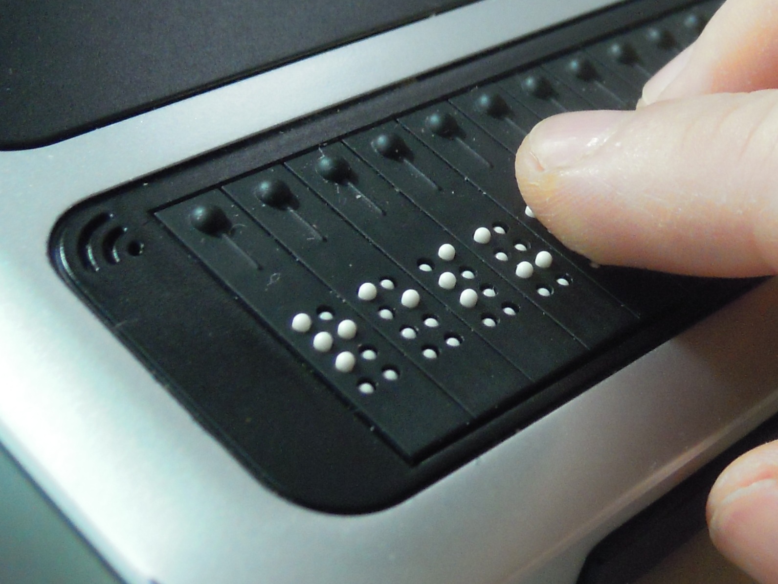
David is blind

David uses a screenreader and a braille display.
Examples
Want to try for yourself?
Open source screenreader NVDABest practice
- Add alternative texts to informative images
- Use proper headings
Tom has reading difficulties

Tom can read simple texts with everyday words.
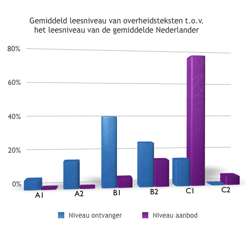
In the Netherlands, 75% of the texts on public websites correspond to reading level C1, but most of the population has a reading level well below that.
Too difficult
Quality jobs ensure economic independence, foster personal achievement, and offer the best protection against poverty... The commission will improve knowledge of the employment situation of women and men with disabilities, identify challenges, and propose remedies. It will pay particular attention to young people with disabilities in their transition from education to employment. It will address intra-job mobility on the open labour market and in sheltered workshops, through information exchange and mutual learning. It will also address the issue of self employment and quality jobs, including aspects such as working conditions and career advancement ...
Best practices
- Take your audience into account while writing
- Avoid jargon
- Keep texts short
- Use active sentences
- Delete redundant words
Easier
Jobs are important because they protect people from being poor and make sure that people have their own independence.
The European Union plans to:
- make workplaces more accessible
- support job training
- increase access to jobs for people with disabilities
Source Easy to read version of European disability strategy (PDF)
Hilde is deaf

Uncaptioned videos are useless to Hilde.
Subtitles (translation)

Captions for deaf and hard of hearing individuals
Text version/transcript
 - The Adventure Zone transcript - TAZscripts - Mozilla Firefox 2021-02-09 13.11.45.png)
Best practice
- Add subtitles to videos
- Provide a textual transcript
Why do you use captions?
English isn't my native language. With captions, it's easier to understand and I remember more of the words I'm trying to learn.
When characters are mumbling, or speaking with an unfamiliar accent.
There are many people in one room, all using different screens (competing noise).
I'm watching tv with the volume down because my baby is asleep.
Loud, crunchy snacks.
What can you do?
Focus points according to specific themes
Keyboard accessibility
All functionalities that can be achieved by using a mouse must work when using a keyboard as well.
Put your mouse aside
- Use the tab key to navigate through links, buttons, and forms (MacOs might need extra configuration)
- Links and buttons can be activated with enter
- Form elements can be used with the spacebar or arrows
Basic test
- Can you see the focus outline?
- Can you access everything on the site?
- Is the reading order logical?
- Can you use all features?
Can you see the focus?
When tabbing through a website, can you see the focus outline at all times? (- / +)
Focus style
Don't remove it:
a:focus { outline: none }Enhance it:
a:focus { color: #fff; background: #00F; }Can you access everything on the wesite?
Are all links, form fields, and buttons accessible by tab key?
- Not accessible: div onclick
- High risk for errors
- Example: try to reach the button "extra website" on Dilbeek.be
- Always use
a hreforbutton
Is the reading order logical?
- Reading/tab order = defined by the order of elements within the source code
- Source code must correspond to visual reading order
- Beware of responsive layout
Exception: cookie banner
Can you use all features?
- Can every link be activated with enter?
- Can each radio button be selected with the space bar ?
- Can each button be clicked using the space bar or enter?
- Can each list be navigated with the arrow keys?
Keyboard interaction
- Always works with native HTML: a, button, input, select, list,...
- Custom-made widgets and forms: all accessibility has to be provided by you.
- Use authoring practices to provide accessibility.
Tabindex attribute
- Influences tab order
- Only used in specific situations
- Using the tabindex attribute by Léonie Watson
Tabindex="0"
To make an element reachable with the tab key: use tabindex="0"
When using div or span.
Tabindex="-1"
- Makes an element focusable but not included in the tab order.
- Use JavaScript for focus management (later more).
- Example: to draw attention to errors when filling in a form.
Tabindex="1"
- Use tabindex="1" (and higher numbers) to enforce a specific tabbing order.
- Use sparingly: prone to errors and confusion.
- Especially when you forget elements (negative example)
Also keyboard-related
Skip links
- Useful when navigation is complex
- Use sparingly
Keyboard trap
Make sure the focus doesn't get trapped within an element or compoment, e.g. form or a list
Keyboard shortcuts
When you add shortcuts:
- allow user to turn them off
- allow user to redefine them to their own needs
- make the shortcut available only when the component using it receives focus
Example
- YouTube allows you to pause a video using the letter k
- Shortcut only works when the video is focused, not anywhere else on the webpage
- Why: to avoid overwriting user's pre-existing custom keyboard shortcuts
Links
Good links
- Are visible to everyone
- Have a meaningful link text
Differentiate links and text visually
Why make link texts meaningful?
- Visitors scan links first
- Screenreader users use link lists for navigation
- SEO rewards usage of relevant keywords in link texts
What is a meaningful link text?
- The link text states the link's goal
- Keep it brief
- Consequences are clear: e.g. download pdf, play video, play sound,...
Bad examples
- Click here
- Full URL
- 'Download' without extra information
- 'Brochure' without the title of the document
- << < May 2021 > >>
- more ...
A link is a promise
Semantics
Use proper HTML tags:
- Headings: h1-h6
- Lists: ul/ol
- Tables: th, caption, tr, th, td
- Regions: header, nav, main, footer
Headings
- Headings are marked as HTML headings
- Big and bold does not equal a heading
- Headings are followed by related content
- Use proper heading levels to create a logical hierarchy
How to check heading levels
- User Web Developer Toolbar
- Choose Outline > Outline Headings
- Check 'Show Element Names When Outlining'
- Headings are now marked, including the heading level
Lists
- No DIY bullets (-, °, *)
- Lists must contain more than 1 item
- Navigations are usually lists
Tables
- Th-elements for table headings
- Caption for legend (if present)
- Example
- Exercise : inspect and correct
HTML5 sectioning elements
headerandfooternavfor menu and submenumainfor main contentarticleonly for sections that can be read independently (don't overdo)
Don't misuse semantic elements
- Don't use h6 to style small paragraphs
- Don't use blockquotes to indent content
- Only use nav for main navigation regions (use sparingly)
Exercise: identify the structure of a page
- Pick a page on a website
- Observe the page without looking at the code
- Identify the landmark regions: header, main, footer, nav
- Identify the headings and their levels
ARIA
Accessible Rich Internet Applications
ARIA
- To make advanced web components accessible
- Extra techniques to satisfy WCAG success criteria
- W3C ARIA Authoring Practices Guide
Assistive technology and semantics
The accessibility tree
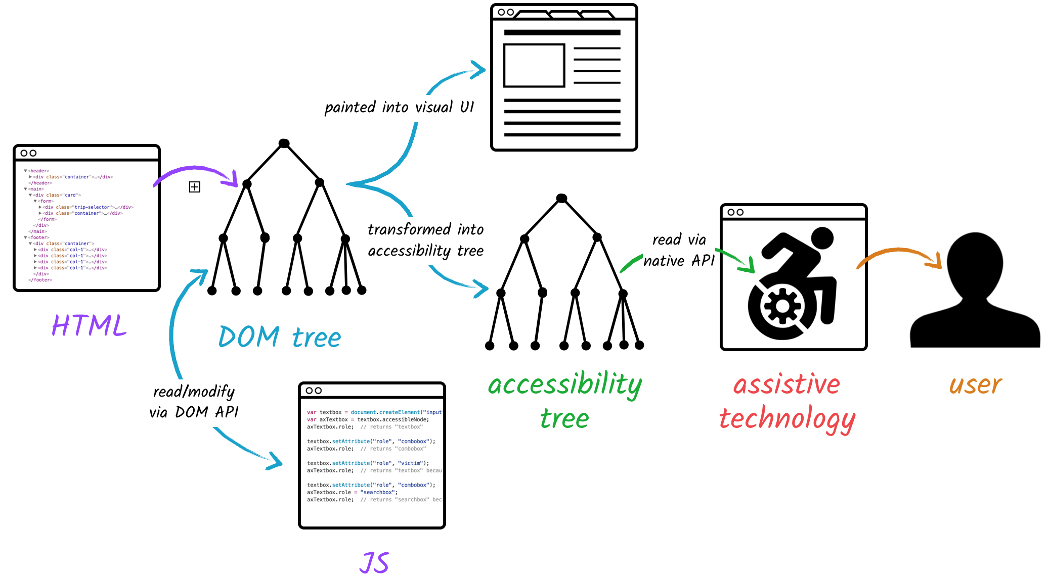
Chrome Dev Tools
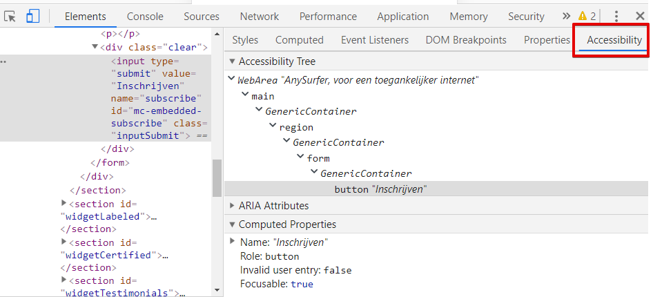
- The browser creates an accessibility tree based on source code
- Assistive technologies access this information via accessibility API
- Each component has a name, role, state, properties and sometimes a description
- Native HTML elements provide those implicitly
<button>Search</button>Accessibility tree:
- Role: button
- Name: Search
- State: unselected
- Property: focusable
Accessibility tree:
- Role: /
- Name: /
- State: /
- Property: /
Chrome Developer Tools
ARIA attributes
Change information in the accessibility tree.
ARIA-attributes change semantics
- Their main purpose is to add missing semantics to the accessibility tree.
- Can also modify semantic information.
- Can also delete semantics.
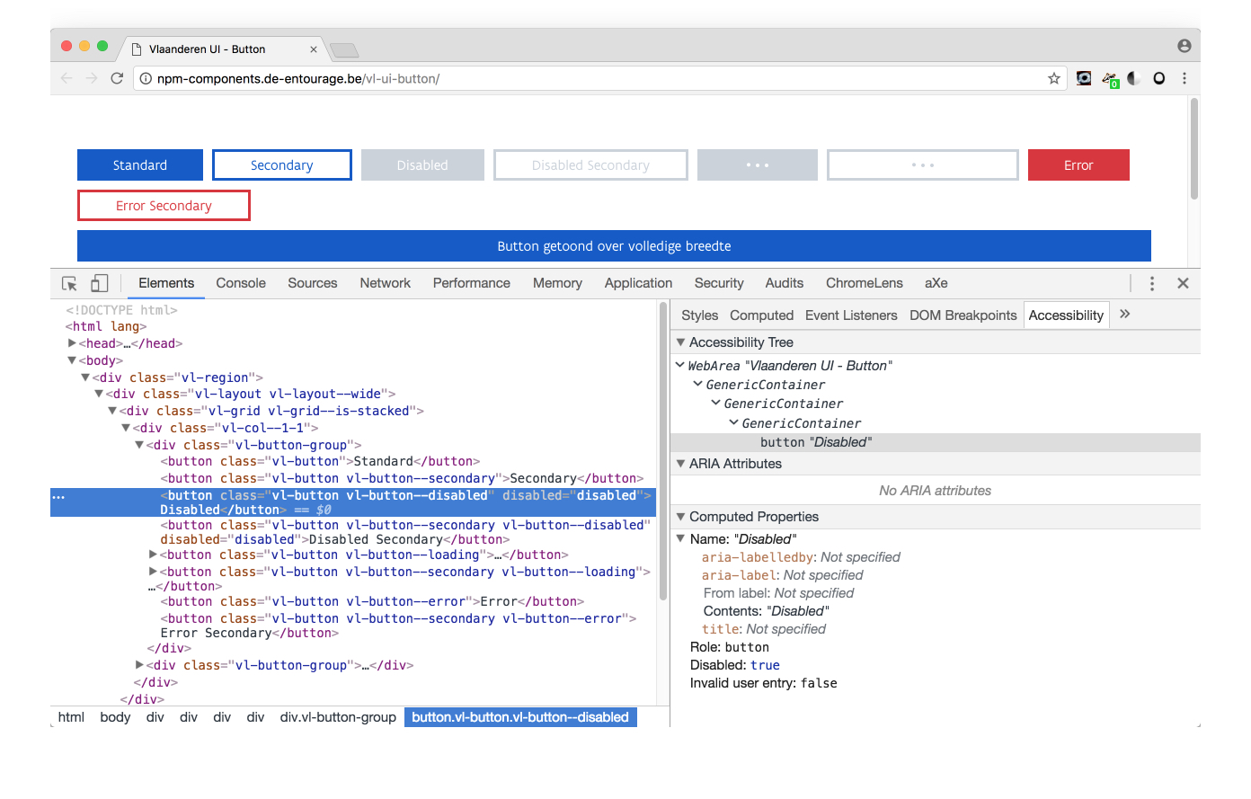
1. Role
- In accessibility tree, each component needs a role.
- If an HTML element exists with the desired role: use it.
- Semantic elements fill the accessibility tree.
- Also the
role-attribute defines the role of a component in the accessibility tree.
Good example: tabs widget
- In HTML, there is no semantic element for tab panels.
- They are
divs and those have no role in accessibility tree. role="tabpanel"completes the accessibility tree.
<div id="tabpanel2" role="tabpanel">ARIA wins!
- A component can only have one role
- If the component already has an implicit role, the
roleattribute overwrites it.<
Bad example
<div id="main_nav">
<ul role="navigation">- The
ulelement gives the component implicitly the role 'list' role="navigation"changes this role to 'navigation'- Only 1 role possible. ARIA wins! It is no longer a list.
- Screenreader announces navigation section but no list.
Better
<div id="main_nav" role="navigation">
<ul>
Or:
<nav id="main_nav">
<ul>
The role attribute
- Only changes the semantic information in the accessibility tree.
- The role attribute does NOT change
- Behaviour
- Properties
- Appearance
Example
<div role="button">
Search
</div>
No button yet
- Screenreader says "button search" instead of "search".
- But:
- Can't be reached with tab key
- Does not look like a button
- Clicking on it, does nothing
Possible values for role attribute
- Are pre-defined, don't invent them
- Redundancy with HTML elements
- Addition to HTML
role="presentation"role="application"
Redundancy with HTML elements
role="navigation"versus<nav>role="button"versus<button>role="checkbox"versus<input type="checkbox">- ...
Addition to HTML
tablist, tab, tabpanelprogressbarspinbutton- ...
Role names can be confusing (read the spec!)
- Don't use role="menu" for a sequence of links: WAI-ARIA menus, and why you should handle them with great care
- Don't use role="grid" for a sortable table
- Don't use role="treeview" for a drop-down menu
- ARIA: The Cause of, and Solution to, All Our Accessibility Problems
Role="presentation" or role="none"
- Removes the role from accessibility tree
- = deletes semantics
Example
News
Becomes this in accessibility tree:
NewsBut still looks like a heading.
When to use?
- When fixing legacy code with layout tables
- As a compromise in semantic discussions
Role="application"
- Changes the component in the accessibility tree into an application.
- All functionality that assistive technologies provide, is dropped.
- You have to program everything again yourself.
- You must explain the user how the application works.
In practice
- Use extremely rarely
- On a small a container as possible.
- Some roles also trigger aplication mode, e.g.
role="dialog" role="document"inside an application allows default behaviour again in that container.
Summary
- The
roleattribute can add missing information to the accessibility tree - Be careful with overwriting the implicit role.
role="presentation"deletes the semantic role.- Role does not modify how it looks like and how it works.
States and properties
- Component in accessibility tree not only has a role, but also a status and properties.
- Can be added or changed with ARIA attributes:
- How to toggle ARIA values with JavaScript
States and properties
Modify existing states or properties in accessibility tree:
- aria-expanded="true" or "false"
- aria-hidden="true" or "false"
- aria-selected="true" or "false"
- ...
Aria-hidden
aria-hidden="true"removes element from accessibility tree- The element with
aria-hidden="true"remains visible on the screen, but becomes inaccessible to assistive technology - Do not use for interactive elements
2. Name
- Each component needs a name in the accessibility tree
- Implicit: link text, alt attribute, label of button, etc.
- Explicit: aria-label or aria-labelledby
Example
Aria-label
- Attribute value = text
- If component did not have a name, it will be added
- If component already had a name, it will be replaced
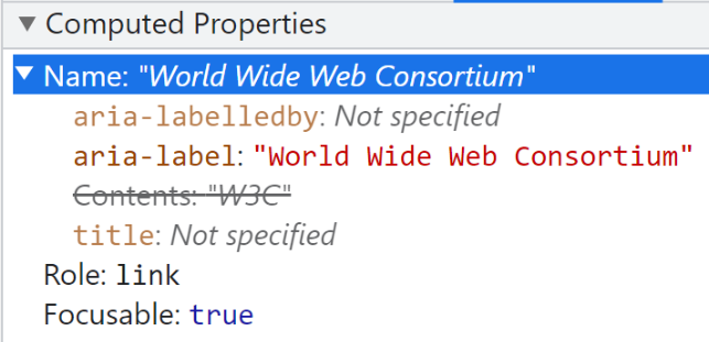
Bad example
Don't overwrite existing name:
<a href="w3.org"
aria-label="World Wide Web Consortium">
W3C
</a>
- On the screen: W3C
- Screenreader reads: [link] "World Wide Web Consortium"
- Dictation software user speaks: [click] "W3C", but nothing happens
Accessibility tree
Aria-labelledby
- Attribute value = id reference to content that is elsewhere
- Multiple references are possible, separated by spaces
Example
<a role="tab" id="tablist1">Monday</a>
<a role="tab" id="tablist2">Tuesday</a>

<div id="tabpanel1" role="tabpanel" aria-labelledby="tablist1"></div>
<div id="tabpanel2" role="tabpanel" aria-labelledby="tablist2"></div>
Warnings for aria-label(ledby)
- Can only be used for components that have a role (not on div or span)
- Only available in accessibility tree: possible mismatch with information on screen
- Don't forget to translate
- Don't overdo it
- Do not repeat the role
Don't repeat the role
<button aria-label="Search button">

<a href="facebook.com" aria-label="Link to Facebook"></a>

<nav aria-label="Main navigation">

<main aria-label="Main content">
Better
<button aria-label="Search">

<a href="facebook.com" aria-label="Facebook"></a>

<nav> of <nav aria-label="Main">

<main>
3. States and properties
- Component has in accessibility tree also states and properties.
- There are ARIA attributes to add or change them.
- How to toggle ARIA values with JavaScript
Examples
- aria-expanded="true", aria-expanded="false"
- aria-hidden="true", aria-hidden="false"
- aria-checked="true", aria-checked="false"
Aria-hidden
- Aria-hidden="true" deletes component and all its children from accessibility tree
- Remains visible on the screen, but becomes inaccessible for assistive technologies
- Don't use it for interactive elements
Example
<div aria-hidden="true">
This text is visible on the screen but you don't hear it with a screenreader.
</div>

<a href="#" aria-hidden="true">
This link does not work for asssistive technology users.
</a>
4. Description
- A component may also have a description in accessibility tree
- Not the same as a name/label, no risk of overwriting
- Aria-describedby=""
- Value = 1 or multiple id references
Example
<label for="email">e-mail</label>
			<input type="text" name="email" id="email" aria-describedby="error17">
			<p class="error" id="error17">The email address is not valid</p>
Screenreader reads
When focus reaches the edit field with the tab key:
E-mail address, edit field, The email address is not valid.
Usage
- Rarely
- Only on component with semantic role
- Only on components that receive focus, such as links, buttons or form fields.
- Only to be added when text is/becomes visible.
Summary
- Don't use ARIA when HTML can be used
- ARIA attributes only manipulate the accessibility tree; They don't add functionality
- Remember: "No ARIA is better than bad/redundant ARIA"
Support
- Accessibility trees can differ per browser
- Assistive technology is improving, but not perfect
- Users are not used to all or new functionalities
Exercises
<ul role="list">
<div class="h2" role="heading" aria-level="2">
<div role="checkbox" aria-checked="true">
<article role="presentation">
<iframe name="google_ads" aria-hidden="true">
What's wrong?
<a href="https://twitter.com">
		<span class="twitter_icon" aria-label="Follow us on Twitter"></span>
		</a>
What's wrong?
<label for="tel">Phone number:</label>
		<input type="text id="tel" aria-labelledby="nota" />
		<p id="nota">Please do not include spaces, dashes or periods</p>
Colour & contrast
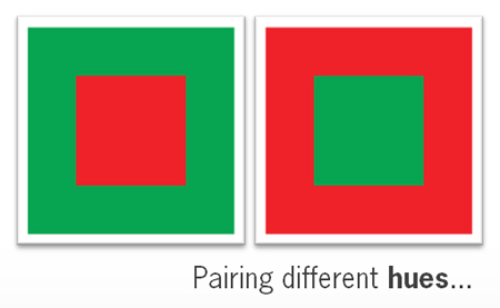
Use of colour
Don't use colour alone to convey information
body {
	 filter : grayscale(100%);
	}
Sufficient contrast
- Text smaller than 24px: minimum 4,5:1
- Text larger than 24px: minimum 3:1
- Bold text of 18,5px and more: minimum 3:1
- User interface components: minimum 3:1
Icons
Form fields
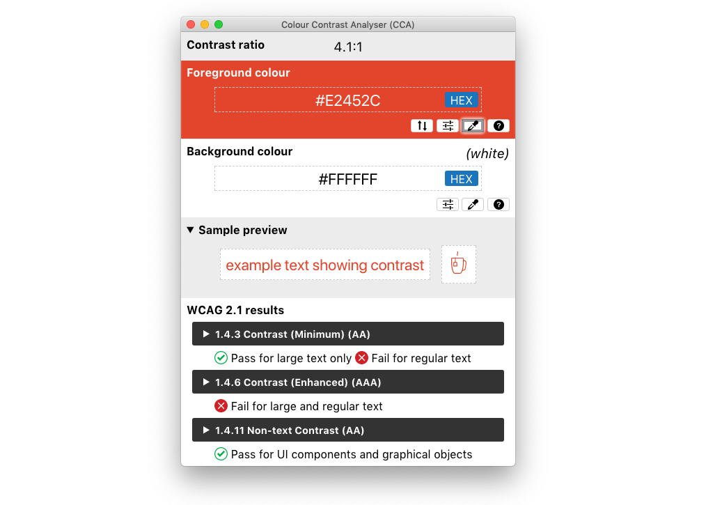
Colour Contrast Analyser
Tip
Use different shades of the same colour instead of different colours.
Tools
Images
Alternative text
- Provide images with an alternative text
- Content depends on:
- image type
- context (informative or decorative)
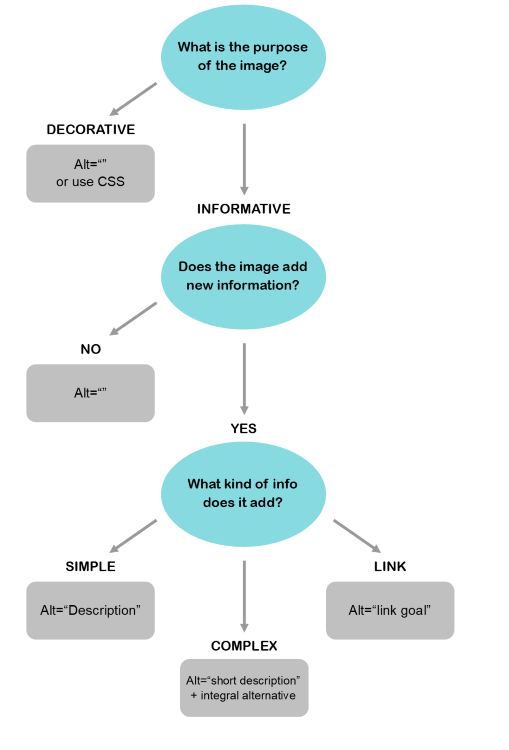
Decorative images
- Preferably as CSS background image
- <img alt="" />
- Screenreader will ignore both examples
- A link is never decorative

Photo's
Describe the image briefly


Graphics and text
Repeat the literal image text in alt text


Can it be done with HTML & CSS?
Avoid images of text

Image as a link
Link goal > image description

Images with complex info
- Map
- Organisation chart
- Diagram
- Infografic
Brief alt text and equal alternative
Example: map
Example: text alternative map
Example: infografic with numbers
CSS background-images
a.twitter:after {
	 content:url('icon_twitter.png');
	}
When they contain information: provide hidden content
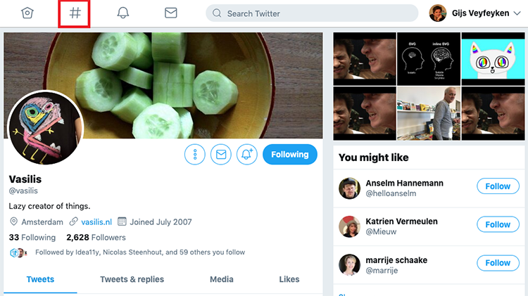
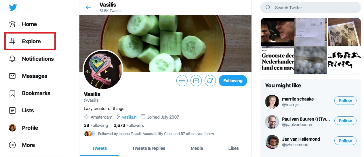
Twitter
a.twitter:after {
	 content:url('icon_twitter.png');
	}

	.visuallyhidden {
	 border: 0;
	 clip: rect(0 0 0 0);
	 height: 1px;
	 margin: -1px;
	 overflow: hidden;
	 padding: 0;
	 position: absolute;
	 width: 1px;
	}
Icon fonts
- Add character using CSS (:before or :after)
- Hide character using
aria-hidden="true" - Decorative: hiding character is enough
- Informative: add an invisible textual alternative
SVG
- Scalable Vector Graphic
- Still some support issues from screenreaders
Bulletproof:
<img src="logo.svg" alt="logo AnySurfer" />
Theory, but not always supported
<svg>
<title>brief description</title>
<description>extended description</description>
...
</svg>
ARIA: moderate support
<svg role="img" aria-labelledby="title">
 <title id="title">AnySurfer logo</title>
 ...
</svg>
SVG within a link: add invisible content
<a href="index.html">
 <span class="visuallyhidden">AnySurfer home page</span>
<svg role="presentation" focusable="false">
...
 </svg>
</a>
Or add ARIA-label, e.g. for a button:
<button type="button" aria-label="AnySurfer home page">
 <svg role="presentation" focusable="false">
 ...
 </svg>
 </button>
Images on social media
Social media: tips
- Don't replace letters with emojis
- Don't overuse emojis
- Use CamelCase: use a capital letter at the start of every word within a hashtag
- Don't use special characters in your username
Distractions, motion & time limits
Flashing
Don't create content that can cause epileptic seizures.
- Avoid (strobe-like) flashing of 3 or more flashes/second.
- Important: possible trigger for epilepsy, migraines, light sensitivity, sensory overload,...
Flashing
Add a warning for users
Examples:
(WARNING: links can trigger seizures)
Motion
When animation on a webpage starts automatically and plays for longer than 5 seconds:
- Give the user control: add a pause button
- Best practice: avoid autoplay.
Important for people with focus issues and sensory sensitivities.
Motion
- Scrolling text
- Slideshow
- Background video
- Animated GIF
- Flashing content
- SVG animation
- Autoplay
- ...
Don't start audio automatically
When an audio fragment starts and plays for more than 3 seconds:
- User must be abke pause or stop the audio manually
- Best practice: don't autoplay audio
- Good example: Amazon Prime
Pop-ups
- Use sparingly
- Avoid unexpected behaviour: content must be related to the intended action
- Never while loading a page
Cookie banners
When a cookie banner overlaps with content:
- Easy to click away
- At the top top of the source code
- Avoid keyboard traps
Time limits
- Notify the user when time limit is about to expire
- Give user the option to extend their session
Responsive
Web
Design
For whom?
- Mobile devices
- People with low vision: usage of text magnification leads to mobile display
- Screenreader user with a non-maximised screen.
Resize text
- Magnification up to 200% without loosing content (e.g. overlap)
- Browser zoom (cmd of ctrl +)
- Is all content still visible within mobile display?
Display orientation
Allow both landscape and portrait mode
Example: a mobile device mounted on a wheelchair cannot be tilted.
Reflow
At a width of 320 CSS pixels:
- No loss of content or functionality
- No horizontal scrolling
320 CSS pixels is equivalent to a starting viewport width of 1280 CSS pixels wide at 400% zoom.
Text spacing
No loss of content or functionality when adjusting style properties:
- Line height (line spacing): at least 1.5 times font size;
- Space between paragraphs: at least 2 times font size;
- Letter spacing (tracking): at least 0.12 times font size;
- Word spacing: at least 0.16 times font size.
Don't disable pinch to zoom
<meta content="width=device-width;initial-scale=1.0;
			maximum-scale=1.0; user-scalable=1;" name="viewport" />
<meta name="viewport" content="user-scalable=no" />Forms
Label and fields must have visible connection
- Identical value for <label for=""> and <input id=""> (Examples)
- Date format (dd/mm/yyyy or local equivalent)
- Required fields (*)
Fields without visible label
- Use title attribute or aria-label
- Example: slider component in survey
Placeholder is not enough
<fieldset>
Legend = label for all fields in the same fieldset
Date picker
- Doesn't have to be accessible
- Give user option to type date as well
- Or use drop-downs for day, month, year
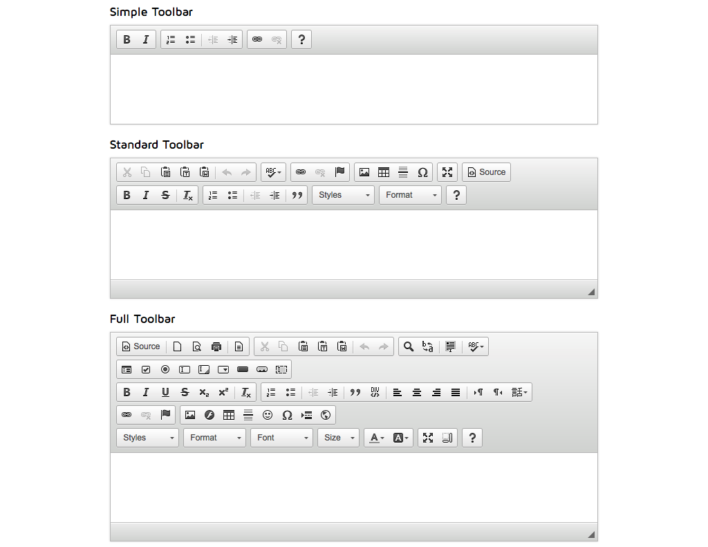
Use standard form fields
- Accessibility already included
- Theoretically possible to create a drop-down or radio buttons using JavaScript, but
- DIY accessibility using ARIA: difficult, often contains mistakes.
Identify input purpose
- Communicate input expectations to browser
- Use autocomplete to enable correct autofill, see example
- Commonly used information like name, address, email, phone number,...
- Provide fields with an autocomplete attribute when a value for it exists: HTML5 specification for Autofill
	<label for="name">Last name</label>
	<input autocomplete="family-name" type="text" id="name" name="name" />
	<label for="country">Country</label>
	<input autocomplete="country" type="text" id="country" name="country" />
Spam protection
- Don't ask user to retype characters (captcha)
- Use alternative: time analysis, honeypot, email/text verification,...
- Inaccessibility of CAPTCHA: alternatives to visual Turing tests on the web
Form validation
- Every form must include a send button
- Make error messages easy to find (manage focus)
- Describe problem and location of related field
- Combine with visual cues (colour, icons)
Other WCAG success criteria
Meaningful page title
- Title element for each webpage
- Name page | name website
Lang-attribute
- Must be present in HTML-element of each webpage
- Indicates the language of page's content
Examples:
<html lang="nl">
	<html lang="fr">
	<html lang="de">
	<html lang="en">
Multiple languages
- Does your page contain multiple languages?
- Provide a lang-attribute for deviating containers.
Example
<div lang="en">
	<a lang="en" href="#">Download the leaflet in English</a>
	<span lang="en">
Valid source code
WCAG is a W3C standard and requires correct HTML usage.
Down-event
Don't attach the action to the down-event of a key stroke, only to the up-event.
- Prevents 'triggering' an action when unwanted.
- Important for people with a motor impairment.
Multiple ways
More than one way is available to locate a webpage within a set of webpages except where the webpage is the result of, or a step in, a process.
Consistent navigation
Navigational mechanisms that are repeated on multiple webpages within a set of webpages occur in the same relative order each time they are repeated, unless a change is initiated by the user.
Consistent identification
Components that have the same functionality within a set of webpages are identified consistently.
Best practice
You have to register...
	Register
Dynamic updates
What?
A user's action triggers a dynamic update within the same page.
Examples
- Extra form fields appear based on one's choice
- Disclosure = button to show/hide content
- New overlay appears
- Results are filtered
- A confirmation or error notification appears
- Search results are shown
- Single page application
Accessibility
- Is the dynamic update predictable for all users?
- How can we announce a dynamic update to a user who doesn't have a visual overview of the screen?
Possible techniques
- Do nothing
- Follow ARIA design patterns
- Move the focus to the info that has appeared
- New info is contained within live region
- Add an explanation
Technique 0: do nothing
- When dynamic update occurs lower in the page, and the user does not have to know that right away.
- E.g. Booking.com: when travelling with children, extra fields appear to provide their age
Technique 1: ARIA design patterns
- Some ARIA design patterns add semantic information that helps to understand dynamic updates.
- Tabs
- Carousel
- Disclosure = show/hide component
Example: disclosure
- = a button that shows or hides contents by expanding or collapsing it
- See article Show and hide content
- Can be done with
summary/details - Disclosure design pattern
aria-expanded
- = an ARIA attribute to be added to the button that expands/collapses
- To indicate its state
- It clarifies the function of the button and indicates that it is a disclosure.
- Aria-expanded="true" means "section is now visible"
- Aria-expanded="false" means "section is now hidden"
Examples
Attention
- Correct place
- Indicate correct status at all times
- Neutral label
- Correct hiding technique
- Logic source code order
Correct place
- Add the
aria-expandedattribute to the trigger (link or button). - Don't add it to the container of the content that may be expanded.
Good example
<button class="main-menu-toggle" aria-expanded="false">
	Menu</button>
Bad example
Expanded FAQ question:
<a data-toggle="collapse" href="#collapse01">
Question 1</a>
<div id="collapse01" class="panel-collapse"
aria-expanded="true">
Correct status
aria-expandedis present with correct value when the page loads.- Don't add it after the status has changed.
- Adapt status whenever it changes.
Neutral label
aria-expandedindicates status- Button label should not indicate an action
- Not OK: show menu or hide search function
- OK: menu or search
Correct hiding technique
- Hide collapsed content with
display:none - Content must also be hidden for screenreaders (avoid techniques like class="sr-only" or "visuallyhidden")
Source code order
- First the button that controls visibility
- Immediately followed by the content that may (not) be visible.
Bad example
- Menu in responsive version of Fine Arts museum
- Expanded content is in source code before the menu link.
- Screenreader and keyboard users won't go back.
Conclusion
The aria-expanded technique can be used if new info appears immediately after the button.
Technique 2: focus management
- When new info appears elsewhere on the page:
- Redirect focus to new info
- Article: learning to focus()
Attention points with focus management
- Move focus to the container of the new content or to the very first element inside.
- You may need to add
tabindex="-1"to the element you want the focus to move to. - Loading new content via AJAX may take some time. Delay the focus movement with one second.
Example: show more
- Search results police website
- After tenth search result follows a button "load more".
- Focus moves from "load more" button to beginning of new content.
Conclusion
- Focus management is technique to be used when the user must interact with new content.
- Sometimes new info appears that one just needs to read.
Technique 3: live region
- = a section where content may be updated
- Example: title of currently playing video on Youtube
- When next video starts, info in this section is updated.
Result
- Screenreader automatically speaks modified content upon change
- Read only; focus does not move
- User can't ask to repeat it
- User has no control over live region
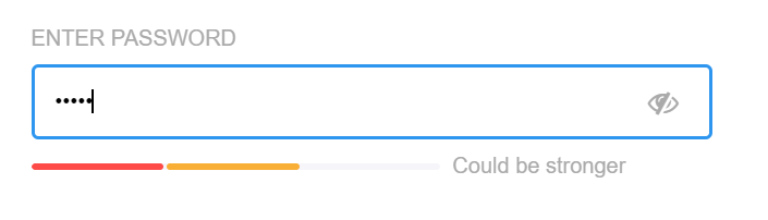
Voorbeeld: wachtwoordsterkte
Voorbeeld: waarschuwing
Technically
- role="status" or aria-live="polite"
- role="alert" or aria-live="assertive"
- Polite waits until screenreader is finished talking; Assertive interrupts
aria-live="off": section is (temporarily) not a live region.
Attention
- Container where new info appears or changes, must already be
marked as live region prior to the update. - E.g. if you want to be able to add an error message to a form field, a container with
aria-live="polite"must be present when the page loads. Later, you will inject the error message into that container.
Possible use cases
- The results counter for a dynamic filter
- The total price when items change in the shopping cart
- Password strength that changes from weak to medium to strong
- A chat box
Don't use live regions
- When information changes frequently: e.g. time remaining counter for a video that is updated every second
- For information that is not important: e.g. Never use for a slide show
- When there are many automatic updates on a page: e.g. real time stocks
Conclusion
- Live region can be a useful technique to attract user's attention to info that is added/changed/modified.
- Only when user does not need to interact with that information.
Technique 4: add explanation
If no authoring practice exists for the widget you're building:
- Try to use previous techniques where apropriate
- Sometimes you may want to add (invisible) explanation
- Extra headings may be helpful to facilitate navigation between sections
Example: dynamic search function
Invisible text before search field:
As soon as you have entered 5 characters in the search box, search results will appear under the heading "Publications found".
Example: dynamic filter
Provide an "invisible" heading at the top of filter options and one at the top of the results section.
Monitoring multiple dynamic updates on a screen, remains a challenge for users who have no overview over the screen (e.g. a webinar).
Video & audio
- Audio only: text transcript
- Video only: text transcript or audio description
- Video with both audio and video:
- Captions
- If necessary: audio description
- Useful but not mandatory: text transcript and sign language
- Accessible video player
Text transcripts must contain
- All spoken lines
- Name of speaker
- Other important sounds
- Audible emotions
Great examples
Subtitles for deaf people (captions)
- In language spoken in the video
- Spoken text as literal as possible
- Must contain audible but invisible sounds:
- Who is talking?
- Important sounds
- Silence
- Tone of voice, audible but invisible emotions
Automated synchronisation
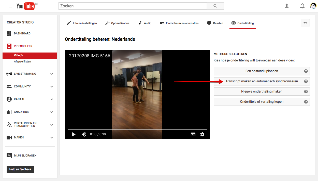
Automated captions YouTube
- Can be a useful starting point for a textual transcript
- Inadequate quality:
- Wrong words
- No punctuation
- Moves like live news feed
Altering YouTube subtitles
- Download automated subtitles
- Remove all time stamps
- Correct all mistakes
- Use punctuations, capital letters, and full sentences
- Add all missing information
Altering YouTube subtitles
- Upload new file back to YouTube
- YouTube will do the synchronising
- Adjust time stamps if necessary
- Deactivate automated captions
Saves time
- AI writes most spoken text correctly
- Helps when synchronisation
- Text transcript and captions are 95% identical
Example:
Captions on social media
Audio description
- Extra audio track for blind users
- Describes non-audible cues
- Not necessary for talking head videos
- The Interviewer
- Netflix > Browse > audio & subtitles
- #WeThe15 with audiodescription (extended)
Avoid missing audible cues
Call us on this number.
- Make the TV host say the actual phone number
- Or, include the number in text separate of the video
This graph shows the evolution of the number of patients admitted to hospital last week.
The number of patients that were admitted to hospital went down from 100 on Monday to 50 on Sunday.
Expertise needed
- Adding audio description to existing videos is a specialist job
- Limited silence in which descriptions can fit
- Discerning crucial information is essential
- Quality recording with a clear voice
New video or audio
- Save the script
- Closed captions are better than open captions
- Avoid the necessity of audio description
- Use AI to transcribe spoken words into text
Accessible video player
- Is it keyboard accessible?
- Are buttons correctly labeled?
- When controls are no longer visble, can they be called back?
Apps
Settings accessibility
- Android and iOS
- Lots of settings to personalise your device with
- Options to connect device to assistive tech like a braille display
Accessible apps
- Most WCAG criteria also apply to mobile devices
- Solutions are different in every programming environment
Pointers
Provide an alternative gesture based on single clicks for complex gestures, such as:
- Pinch to zoom
- Follow a trajectory
- Tabbing with 2 or 3 fingers
Motion detection
- Don't use motion detection as sole trigger for action
- Provide alternatives
- Allow user to deactivate motion detection
Android
iOS
- Accessibility Programming Guide for iOS: Making Your iOS App Accessible
- Learn to create accessible iOS apps with the Deque university app
Widgets
- Which widget?
- Can it be built with native HTML?
- Is a design pattern available?
- Has it been applied correctly?
- Does the widget work for keyboard users?
- Are dynamic updates predictable?
Hamburger or other icons?

Questions
- Are these icons accessible and operable with a keyboard?
- Relevant link text?
- If collapsable element: add
aria-expandedto indicate state - Correct reading and tab order?
Cards
Questions
- Semantics: list or headings?
- Relevant link text?
- Logical sequence order?
- Do images need alt texts or are they decorative?
Examples
Conclusion
- Context dependent
- Article: Inclusive design component for cards
Overlay
- Shown on top of current web page
- User is not supposed to interact with the underlying page
- Build them as a modal dialog
Modal dialog
Focus management
- When opened: redirect focus to new info
- Focus limited to overlay only (keyboard trap)
- After closing: focus on original starting point
ARIA
- role="dialog" because dialog element doesn't have general support yet
- aria-modal="true" to make content outside modal dialog inaccessible
- also possible with aria-hidden="true", but more work and higher risk
Close button
- Label with clear meaning
- Logical reading and tab order
- Focus outline must be visible
- Close with ESC
Documents
Documents
- Use webpages when possible
- Use documents only when necessary
- Create accessible templates to use within organisation
Accessible documents
- Basic principles are the same for webpages
- How to: depends on software used
- Accessible Digital Office Document (ADOD) Project
Word documents
- Use heading styles
- Use built-in functionalities, e.g. use "track changes" instead of crossing out text,...
- Create accessible Word documents
PDF documents
- Start by making the original documents accessible
- Tagged PDF when export from Word and InDesign
PDF checklist:
- Language setting
- Relevant title
- Structure using tags:
- Paragraphs
- Headings
- Lists
- Tables
- Alt text for images
- Reading order
- Tab order
- Reflow sequence
- Use more than colour to convey information
Forms
- Not in Word!
- Possible to create PDF to fill in
- Web forms are best option for users, developers, and data processing
Some allround advice
Use accessible basics
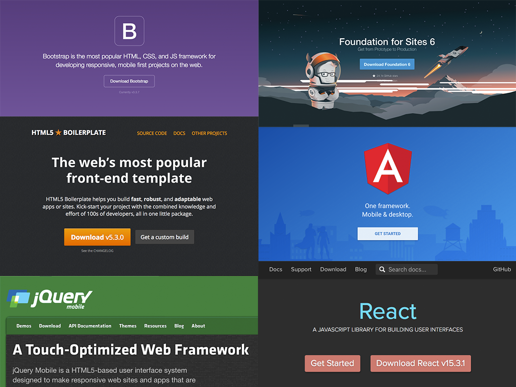
Do certain components reoccur in each of your projects? Avoid double work: make them accessible.
Accessible components
Make it easy for editors
Test while you work
Having to correct accessibility at the end of your project will cost you extra effort and time (=money), and will lead to frustrations.
Contact
AnySurfer
info@anysurfer.be
02 210 61 49
Twitter : @anysurfer_nl